The never-ending story of colour
Published on 16 January 2021
“Illuminating” yellow has been revealed as Pantone’s colour of 2021. The story different brands paint with their choices of colour are, however, far more nuanced.
To be precise, not one colour but two have been elected Colour of the Year 2021. The yellow, which goes by the number 13-0647, is balanced out by grey number 17-5104, known as “Ultimate Grey”. According to the Pantone Color Institute, the combination symbolises “a marriage of optimism and strength. This is a colour combination that gives us resilience and hope. We need to feel encouraged and uplifted, this is essential to the human spirit”, explain the institute’s experts. They analyse global trends, combing the world looking for new colour influences across all sectors, including fashion, art and cinema, as well as observing new lifestyles, technological developments and socio-economic conditions. Following a complicated, and at times painful, 2020, the grey hints at the importance of solidarity, whilst the sunny yellow becomes a positive and desirable hue once more.
That’s right, once more. Because as colour historian Michel Pastoureau points out in a study dedicated to Pantone 13-0647 and its derivatives, the attraction of yellow, which was seen as a beneficial, feel-good colour back in the age of Antiquity, has gradually waned over time. Deemed too flashy, it was even labelled a “dishonest” colour by Europe’s great Protestant reformers. And despite its odour of sanctity being restored during the XXth century, the hue still sits right at the bottom of the Old Continent’s colour wish list. Colours always have a backstory, and another story still waiting to be told.
According to Elizabeth Leriche, yellow is unquestionably a trend, but the hue tells a very different story: the current passion for Mediterranean countries, Minorca and the Balearics, straw, fields, shimmering rays of sunshine, a solar environment... “Today, we’re free, there are no longer so many rules. The brands we work for want to be bold”, comments the lady who offers them guidance through her style consultancy. The very idea of declaring a “colour of the year” isn’t even on her radar. Firstly, because there’s never just one colour. “Each collection starts off as a story and a style that in turn inspire the colours, which gradually become an integral part of the whole.” It’s a veritable balancing act, which not only demands “designing and capturing current trends” but also “envisaging which colours will drive a collection’s success, sometimes as early as two years before its launch.”
“What makes our colour palette so unique is its halftones, its powdery, muted shades, that assert our Belgian roots”, explains Martine Groetaers, stylist and colourist at Flamant. She has been the creative brains behind the brand’s colour chart for over 20 years. A colour chart that has always featured precisely 128 shades. Each year, she strikes off 4 to 6 references and replaces them with new ones. These shades are the result of a delicate alchemy that combines two key ingredients. Firstly, the brand’s identity, its Belgian-ness that she sums up so well: “Tormented skies, cobblestones after the rain, house frontages, the north sea... In actual fact it’s an atmospheric chemistry that neutralises excessively bright hues.” Then there are the latest trends, which she follows like a hawk: I purchase lots of interior design magazines and attend endless exhibitions, as well as keeping my eye on fashion... That’s where I glean my inspiration.” The new hues, created from overtly punchy shades that she has cleverly toned down, will infuse all of the brand’s collections and its wide range of products, including paint, fabric, wallpaper and objects. Five new shades are lined up to hit the shelves this January: Terra de Sienna, Alizée, Atlas, Dakar and Dolce. “This year’s all about earthy shades, based on terracotta, muted and organic hues”, she explains. It’s the next chapter in the story of Flamant’s highly recognisable - and often copied - world. “Whenever I’ve tried to come up with stronger shades, they simply haven’t worked!” she says with a smile.
Maison Dada’s story is shorter than that of the Belgian institution, but colour nonetheless plays an equally important role. “When Maison Dada launched its inaugural collection in 2016, colour was vital in cementing its identity from the get-go”, explains Thomas Dariel, who admits to surrounding himself with a “Mediterranean” colour pallette, a far cry from the discrete shades favoured by the Belgian brand. “The colours I choose must make people sit up and take notice, silently winning them over. My palette is my most vital tool.” The story it tells is inextricably intertwined with that of the brand’s co-founder and leading designer: “I think my colour palette draws as much on the Italian masters of Memphis as on the art of the Tang and Ming dynasties, having spent over a decade living in Shanghai after spending time in Rome. I’ve explored every last inch of China, discovering some true gems with silhouettes and colours the likes of which I’d never seen.” His design process nonetheless prioritises shape over colour, which is only added once the black and white drawing has been completed: “The colour sings out in all its glory, and helps make my design more tangible.”
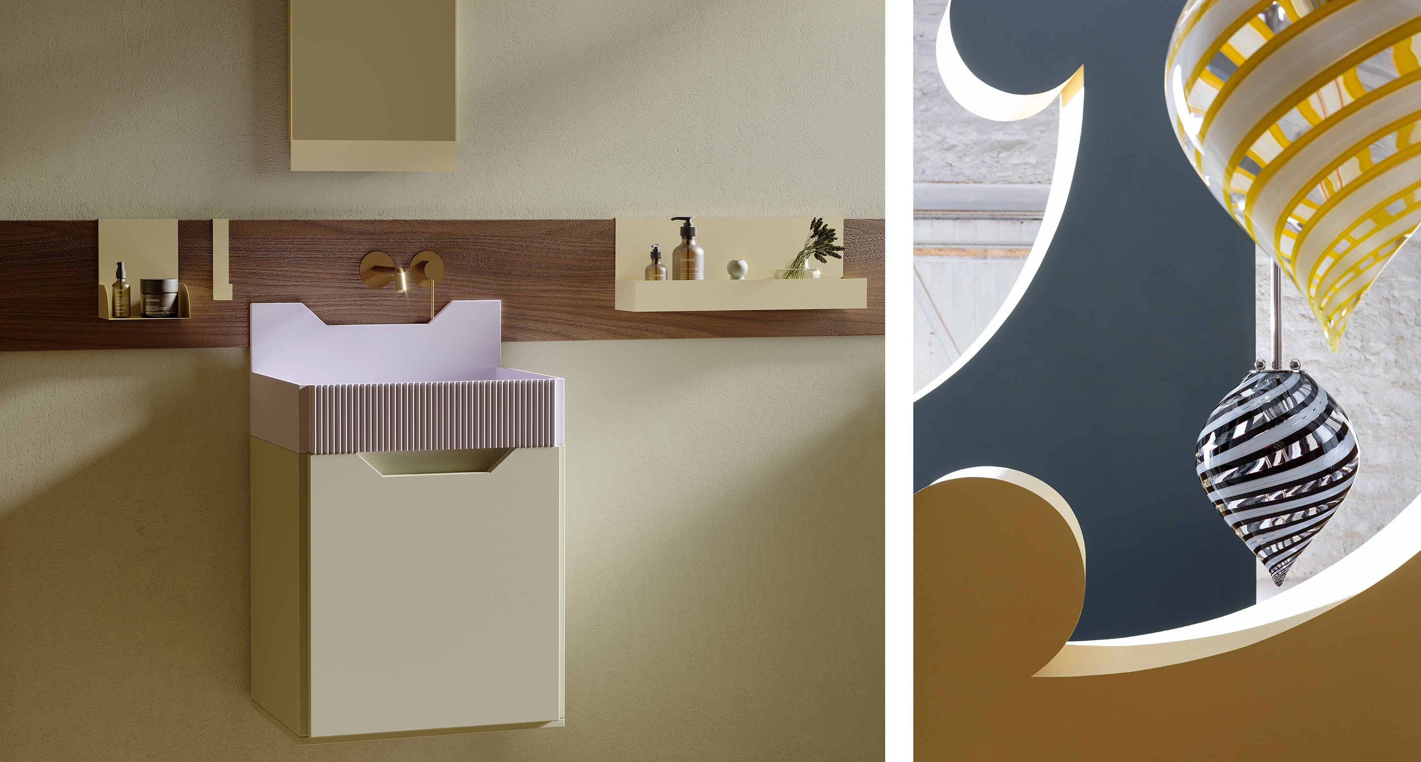
A colour’s unique qualities only truly come into their own when combined with a strong and well-constructed message, such as that purveyed by Italian brand Ex.t. founded in 1945 by Giulio Tanini and run since 2010 by his granddaughters, Ingrid and Azzurra. Their bold stance, which invites us to “live the bathroom differently”, is underpinned by a wild approach to colour in a segment that continues to be dominated by minimalist white. For their latest collection, Frieze, design duo Andrea Marcante and Adelaide Testa gleaned inspiration from Entablatures, a series of works by Roy Lichtenstein. They then worked hand-in-hand with the brand to make a few final tweaks, eventually coming up with the perfect colour pallette.This approach is enabling Ex.t to successfully write a brand new chapter in its story - a story that must intertwine with the equally unique and personal stories of each individual customer, be they colour experts or not. “I can spend a whole day working on a red that a customer says is too dark or has a hint too much raspberry. It’s crucial I get the colour spot on”, explains Elizabeth Leriche. “But at home, I always find myself gravitating back to greens and celadons, turquoises and limes.” Perhaps our oh-so personal preferences are worth analysing on the psychiatrist’s couch... Now, which colour should that couch be?
By Marie Montuir
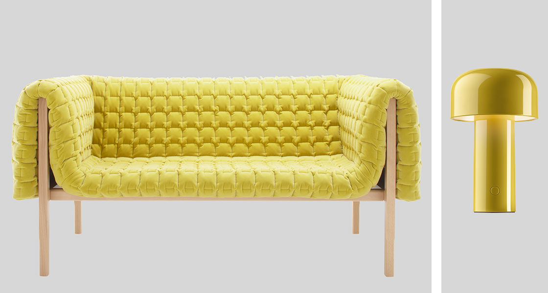
Photos: Collection Frieze - Ex.t ©Ex.t / Collection Balloon - Magic Circus Editions ©Pierrick Verny